Table of Contents
-
Render Events
-
Baystate Tent
-
Kadeema Rentals
-
Luxe Bounce
-
Andco Rentals
-
Bobby Morganstein Events
-
Mega Celebrations
-
Total Events
-
Ideal Tent & Event Rentals
-
Marianne’s Rentals
-
Game Guys
-
Victory Party Rentals
-
Party Bound
-
Kate Ryan Event Rentals
-
Ribbon & Blue Party Rentals
-
Inspired by these amazing event rental websites?
To compete in the modern event industry, great customer service and products are a given. So is a website. But event businesses need more than just a website. They need a great website.
Why? Because a great event rental website doesn’t just look good — it’s also a major sales and revenue driver. According to research from Stanford University, 75% of clients judge a company’s credibility based on its website design.
Websites can be a great source of direct revenue, too. Goodshuffle Pro’s Website Integration, which allows event clients to “shop” rental items and services on a company’s website, has driven more than $325 million in quote submissions for event businesses.
In addition to great design, the examples below all use Goodshuffle Pro’s Website Integration to save time and grow their business. Check them out for inspiration, and contact our team if you’re ready to build the industry’s next great website.
Key Takeaways:
-
Website credibility drives 75% of client decisions.
Clients judge a company’s credibility based on website design alone.
-
Great websites generate massive revenue.
Websites with integrations have driven over $325 million in quote submissions.
-
Social proof builds instant authority.
Display big-name client logos and testimonials prominently.
-
Visual storytelling captures attention.
Use high-resolution videos, beautiful imagery, and before/after content.
-
Integration amplifies booking results.
Connect inventory directly to your website for real-time availability.
-
Clear navigation improves user experience.
Make it easy for clients to browse by categories, collections, and services.
-
Mobile optimization is non-negotiable.
Ensure your site works perfectly on all devices.
Render Events
Location: Dallas, TX
Website Link: renderevents.co
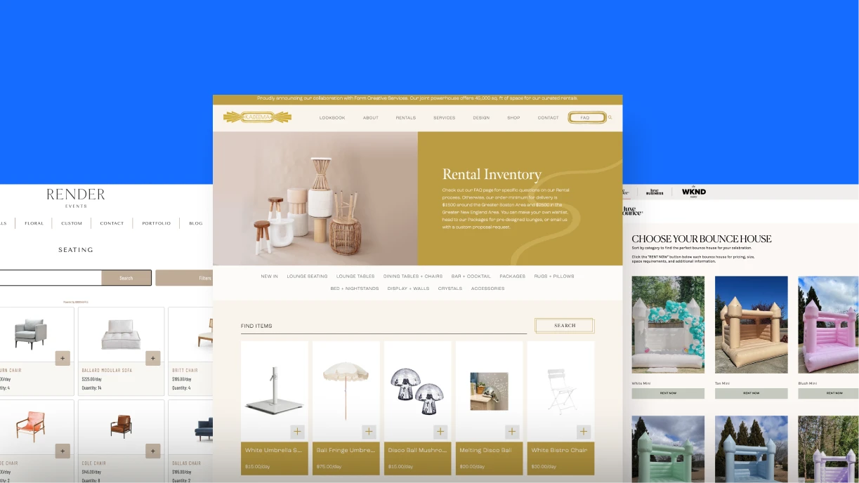
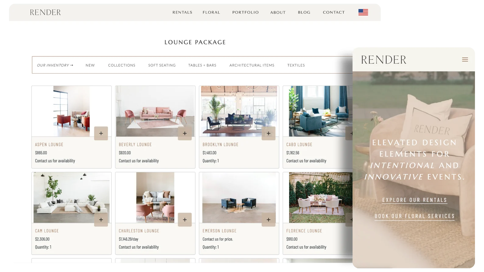
Render Events is known for being meticulous, stylish, and elevated — and its website lives up to the reputation. But this event rental website is more than just eye candy. The homepage contains two forms of social proof, including logos from big-name clients such as Google and Nike, which lend the brand authority and shine light on its corporate events. It also makes smart use of Goodshuffle’s Website Integration, allowing clients to browse through inventory using both categories (ex: tableware) and collections (ex: wedding).
Baystate Tent
Location: Tewksbury, MA
Website Link: baystatetent.com
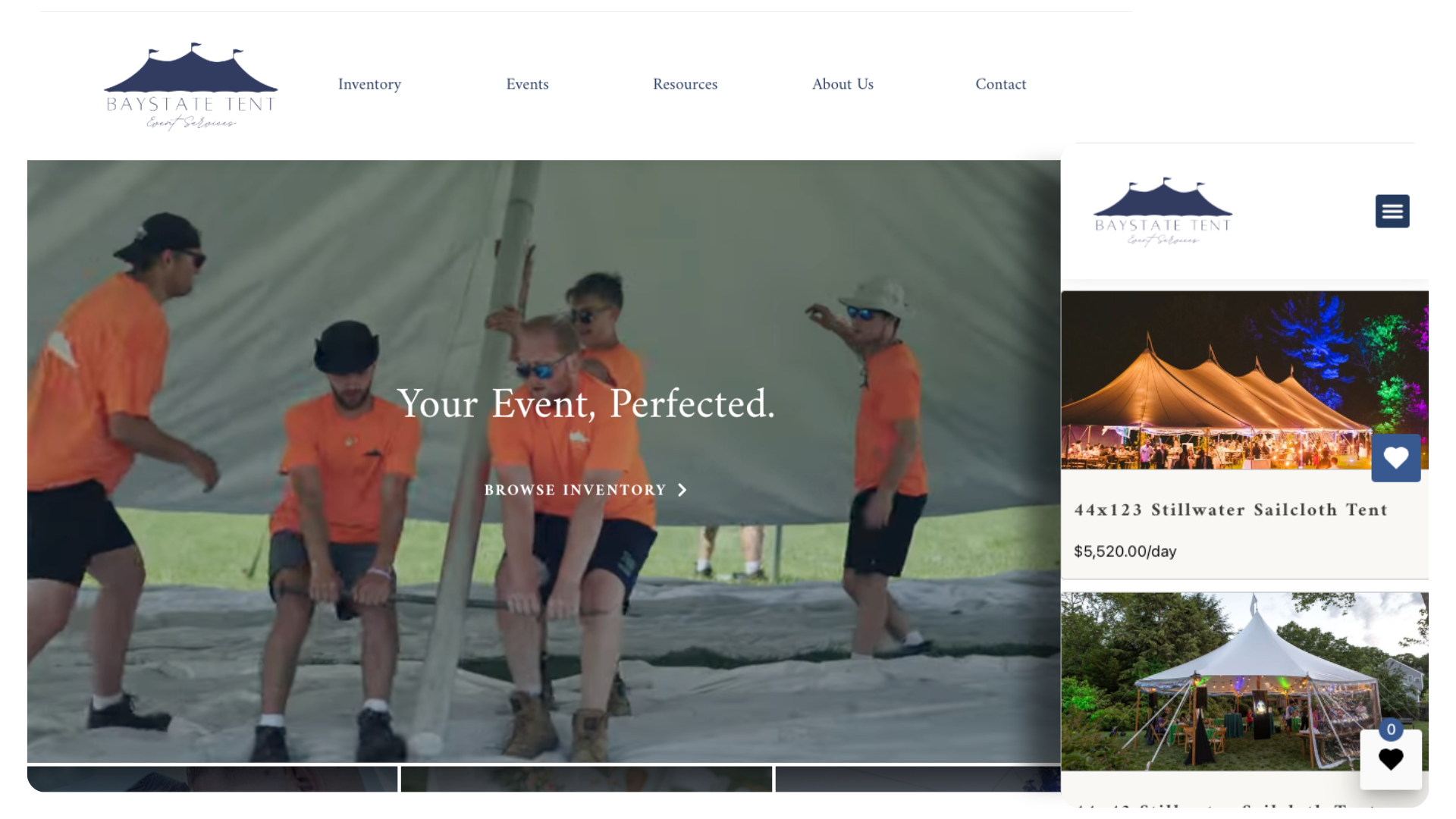
When clients land on Baystate Tent’s homepage, they’re greeted with a high-resolution video of team members installing a large, complicated tent. The quick vignettes of the video make it fun for potential clients to watch, and it does a great job showing that Baystate has no shortage of experienced pros who can handle big jobs. The rest of its website reinforces that message, while also making it easy for clients to browse available tents and rental inventory.
Kadeema Rentals
Location: Walpole, MA
Website Link: kadeemarentals.com
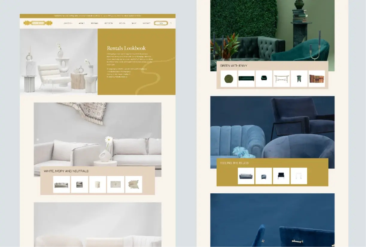
Customization is the name of the game for Kadeema Rental’s luxurious website. From beautiful front-page visuals of chairs and couches to a sleek Lookbook organized by color, Kadeema makes it easy for you to find the perfect pieces for your next event. It’s also crystal clear how they work and what services they offer, setting expectations from the get-go. Plus, a section featuring past clients is impressive when you have brands like Nike, Tiffany & Co., and Burberry under your belt.
Luxe Bounce
Location: Atlanta, GA
Website Link: luxebounce.com
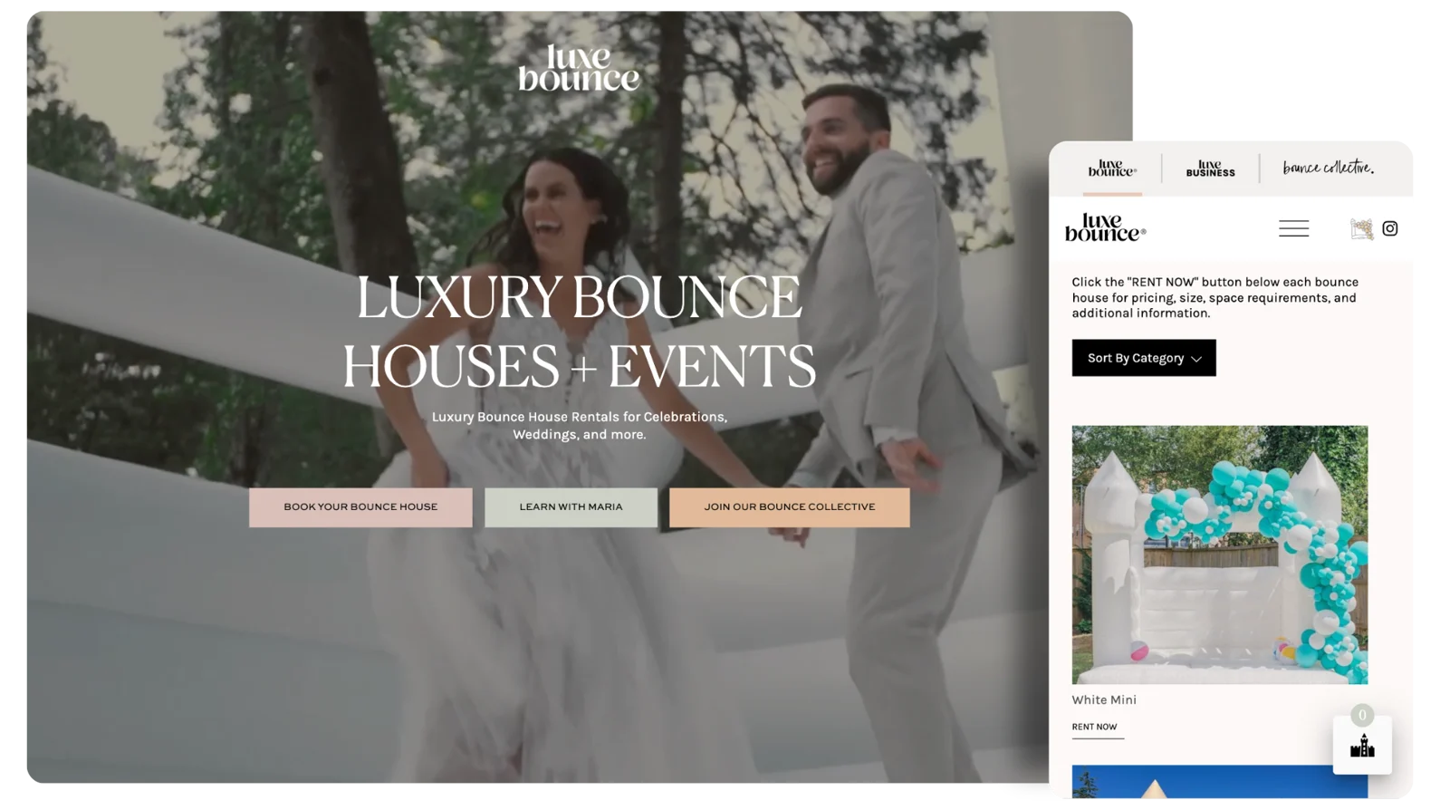
Luxe Bounce is not your average inflatables business… and it’s website is far from your average inflatables website. From the hero video of a wedding party bouncing together, to the interactive feature on brand values, to the vertical photos of this year’s trending inventory, every part of this party rental website makes clients feel “the Luxe Bounce difference.” It’s also strategically designed to funnel clients onto pages where they can browse inventory and request quotes.
Andco Rentals
Location: Cleveland, TX
Website Link: andcorentals.com
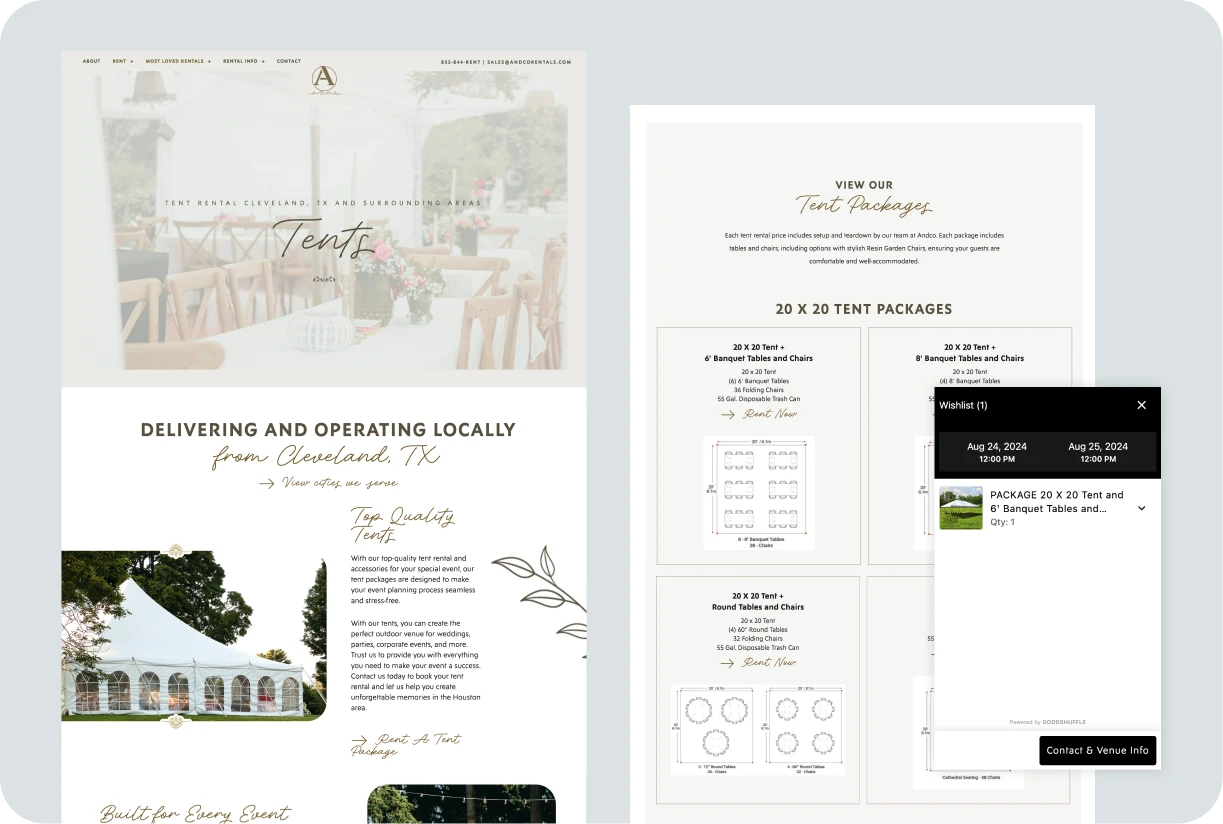
Lighting, design and video take the front seat in Andco Rental’s website. An expansive opening image draws you into the site, and a “Most Loved Rentals” tab shows off the company’s work, from videos of a 360-degree camera booth to collections of marquee letters. Andco’s website really makes you feel like the sky’s the limit for your next event.
Bobby Morganstein Events
Location: Philadelphia, PA
Website Link: bobbymorgansteinevents.com
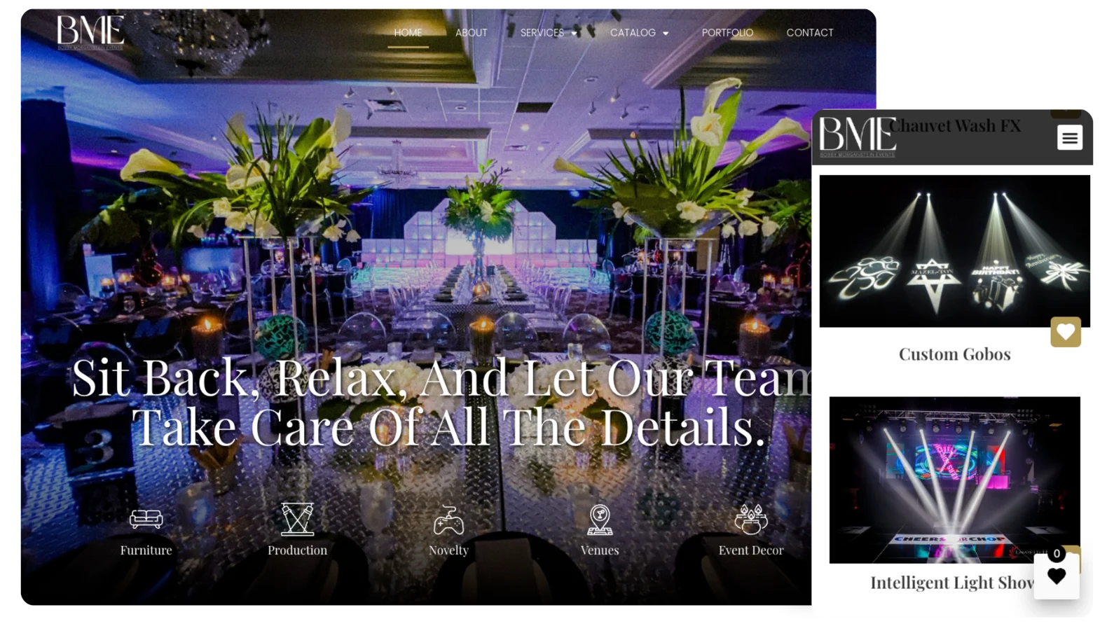
Bobby Morganstein Events is one of the top event production companies in Philadelphia — and as its name suggests, its brand is closely tied to that of its owner, Bobby Morganstein. Its website puts Bobby front and center by placing the About Us section near the top of the homepage, and using a photo that captures Bobby’s, and the brand’s, personality. The rest of the site delivers on this with photos of vibrant event setups, including some as thumbnails inside Goodshuffle Pro’s Website Integration.
Mega Celebrations
Location: Bridgewater, NJ
Website Link: mega-celebrations.com
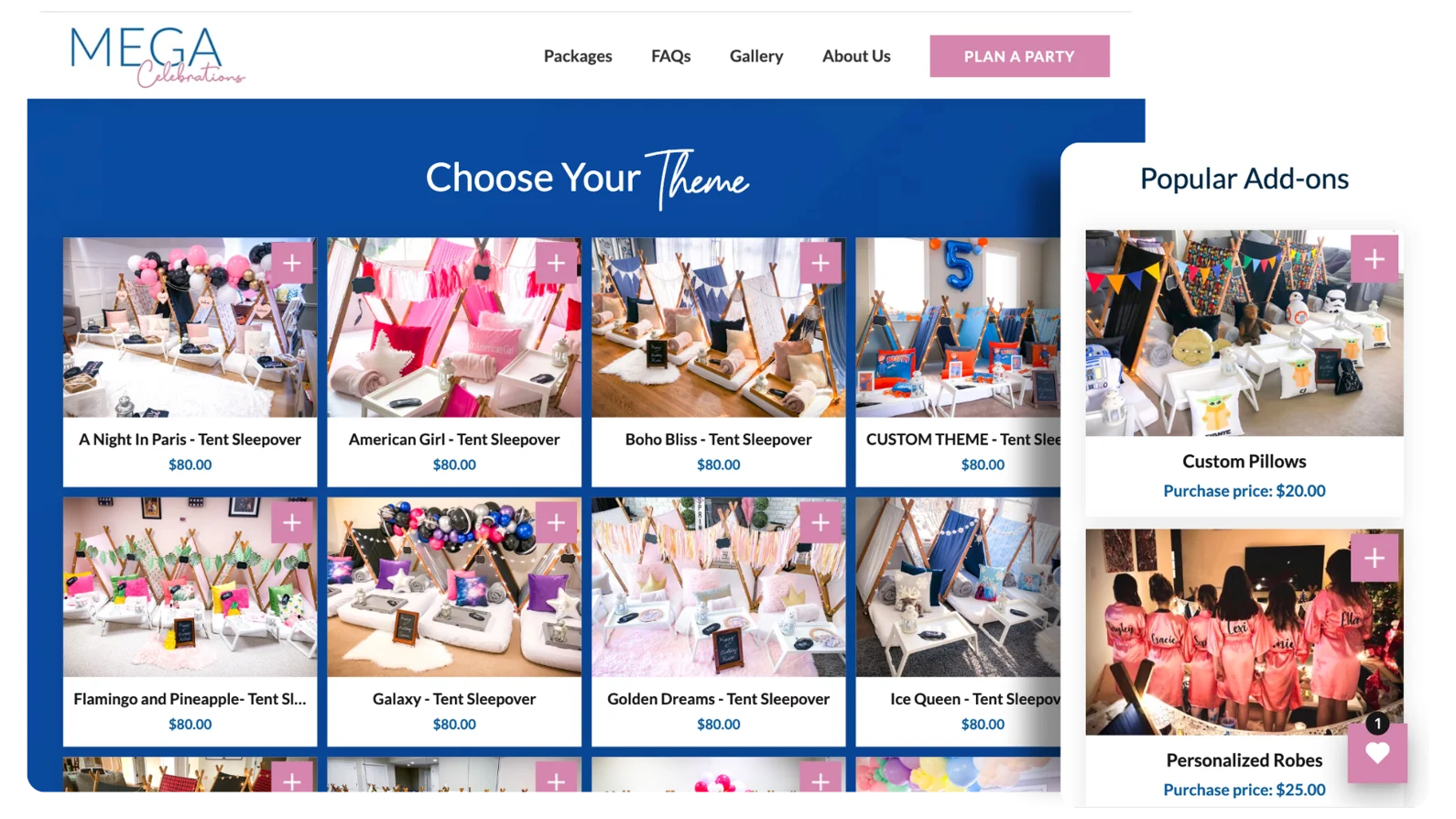
Packages and upsells are two of the most valuable parts of Goodshuffle Pro’s Website Integration — and few companies use them as well as Mega Celebrations does. Its Package pages use colored backgrounds and custom photography to show the seemingly endless themes clients can choose from. Below each set of packages, it features popular add-ons such as custom pillows and personalized robes, natural upsells that increase the company’s average quote value.
Total Events
Location: Schenectady, NY
Website Link: totaleventsny.com
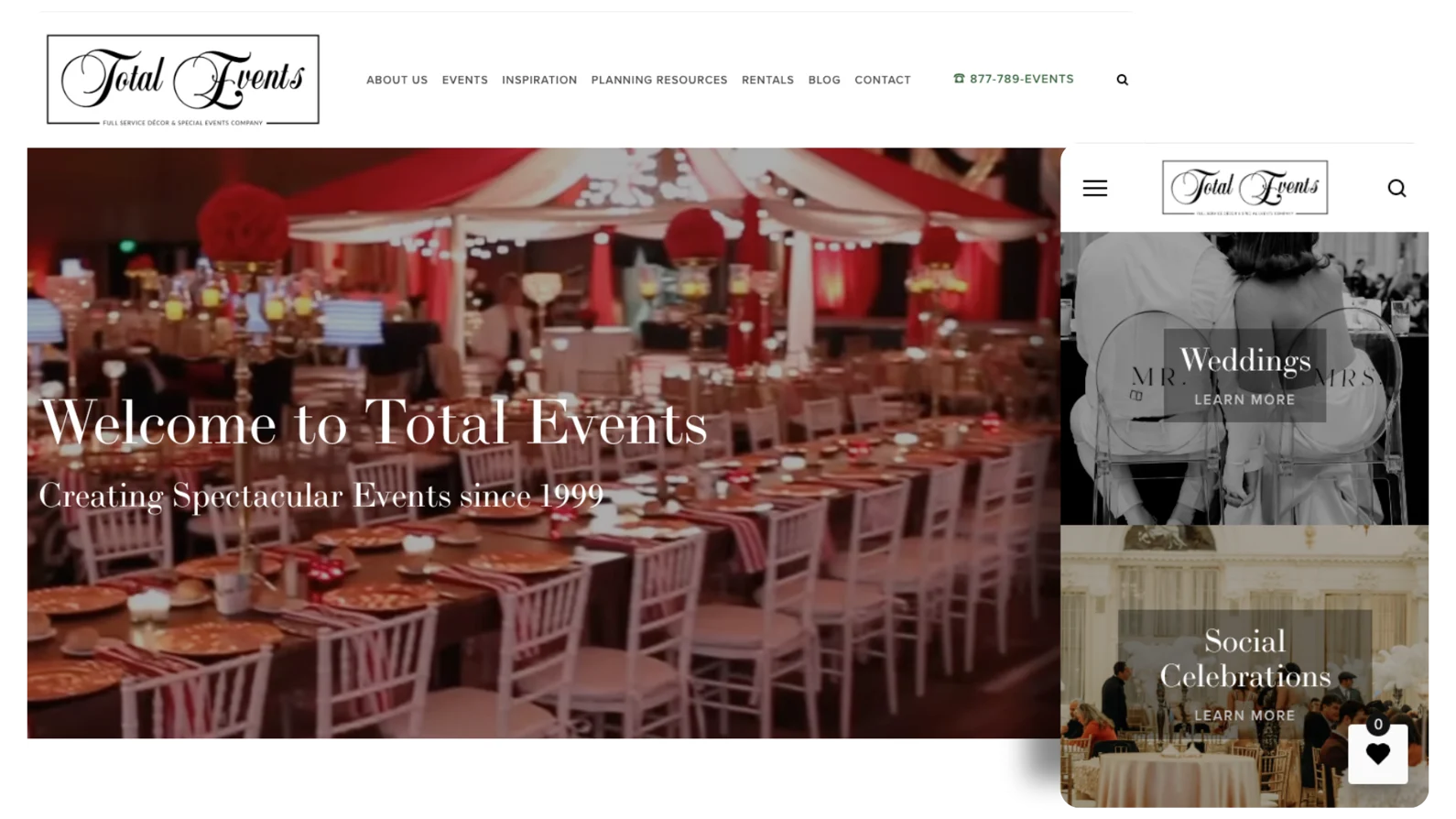
There are a lot of ways to use color on an event rental website. Total Events takes a deliberate approach, ensuring every design decision — from the black-and-white logo to the pops of red and gold on its homepage — makes its brand feel regal and sophisticated. Outside of the homepage, it also makes smart use of Goodshuffle Pro’s Website Integration, applying it not just for large event inventory but also smaller packages aimed at people hosting upscale dinner parties.
Ideal Tent & Event Rentals
Location: Tea, SD
Website Link: idealtentandevents.com
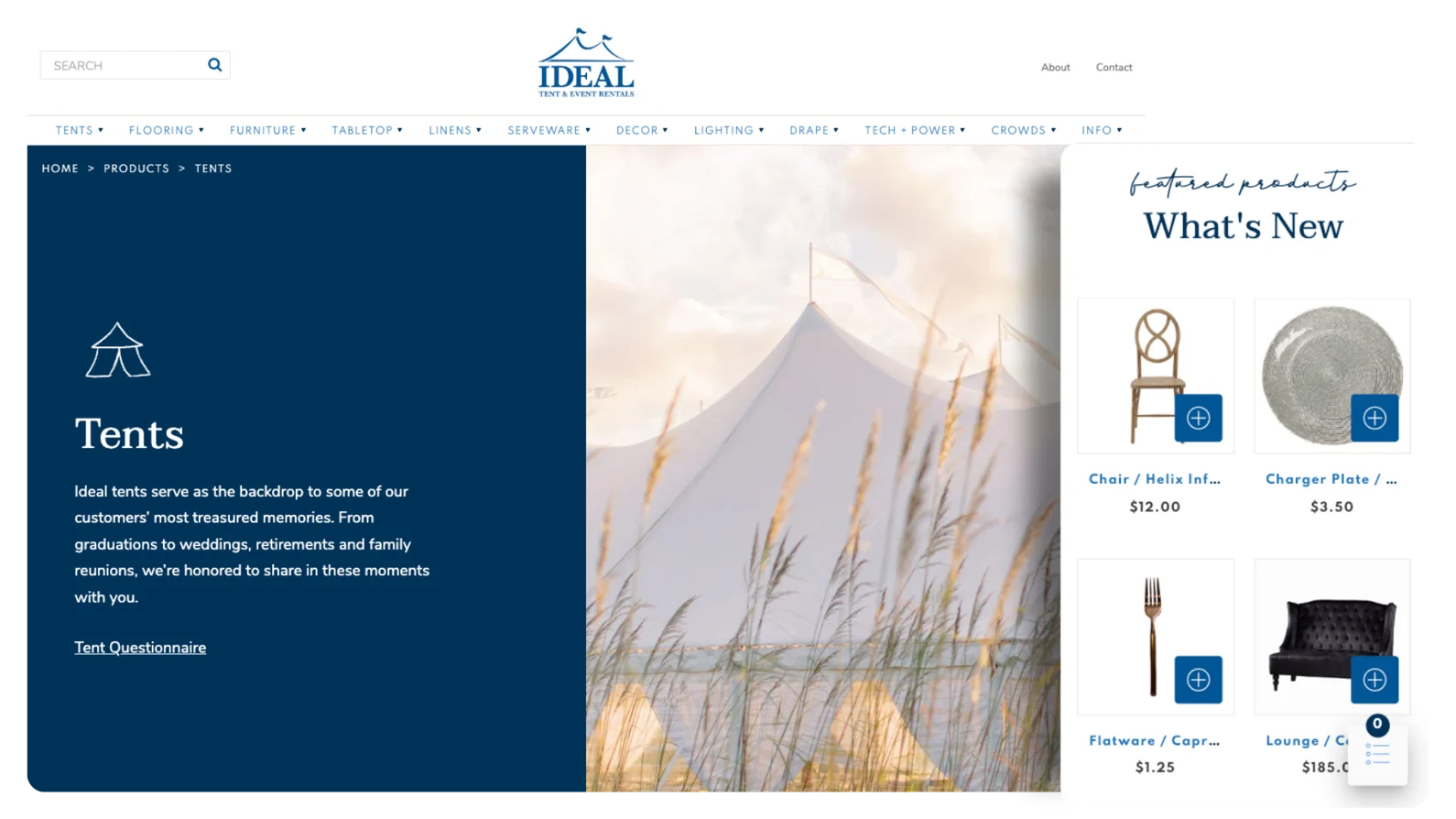
Your website should match the scope of your brand and business, and Ideal Tent & Events does that masterfully. When you land on the company’s homepage, your screen is overtaken by a full-width image of a sailcloth tent cascading behind a field. The size and design of the image capture the vast, beautiful feeling of a tented event in South Dakota, which lends the business local credibility. Below that, a “What’s New” section promotes interesting items that clients can rent online.
Marianne’s Rentals
Location: Oklahoma City, OK
Website Link: mariannesrentals.com
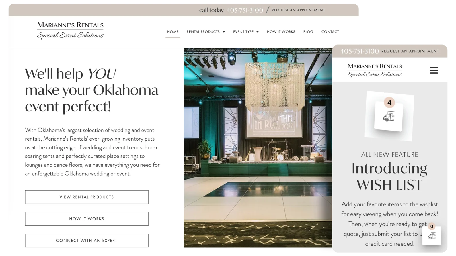
Marianne’s Rentals is an Oklahoma City institution, a family-owned event company that recently celebrated 35 years in business. The content and design of its website projects elegance and experience, but also shows that the brand is on the cutting-edge of digital and event trends. One way it does this is writing a blog on event topics, which allows it to demonstrate industry expertise. It also promotes its Website Integration with a sleek, animated wishlist logo that captures attention by twisting from side to side.
Game Guys
Location: New Orleans, LA
Website Link: gameguys.com
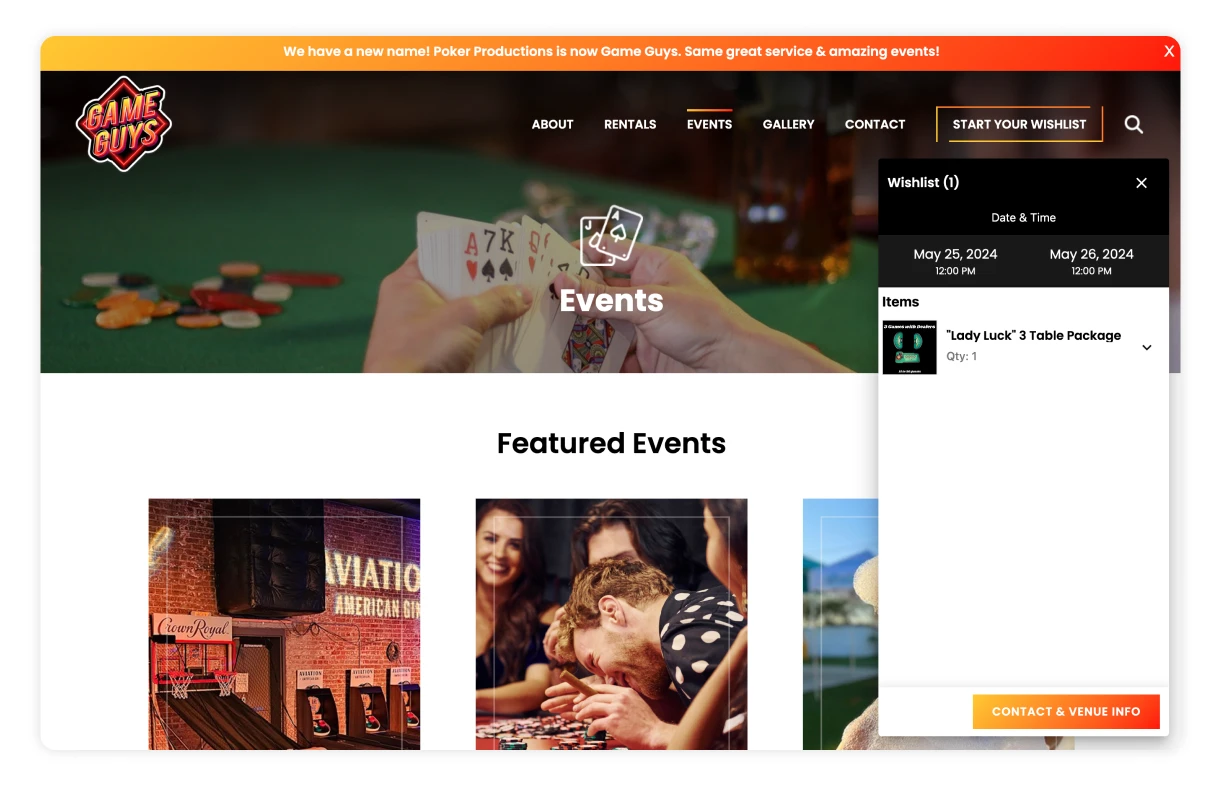
The headline on Game Guys homepage reads “We Bring the Fun,” and the hero video playing behind it backs up the claim. After starting on a high note by helping clients picture the fun of their own casino night, the rest of the website guides them through the different types of events, inventory, and packages Game Guys offers. It leaves no question unanswered, and stands out among its peers by making it easy for clients to submit quotes online.
Victory Party Rentals
 Location: Miami, FL
Website Link: victorypartyrental.com
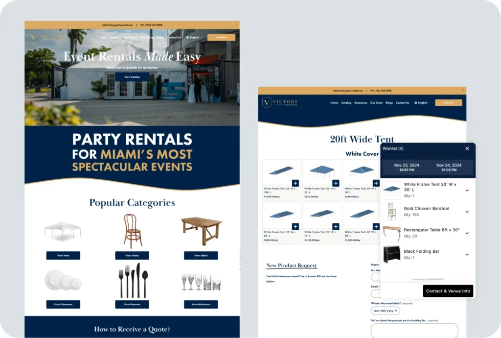
When you land on Victory Party Rental’s homepage, you immediately understand how easy they make the event rental process. You can “receive a quote in minutes,” and there’s even a section on the homepage dedicated to showing you the four steps to getting a quote. Victory even provides you with guides to help you plan your event, including a dance floor and tablecloth size guide, in addition to an FAQ section to answer commonly asked queries — talk about helpful.
Party Bound
Location: Cumming, GA
Website Link: party-bound.com
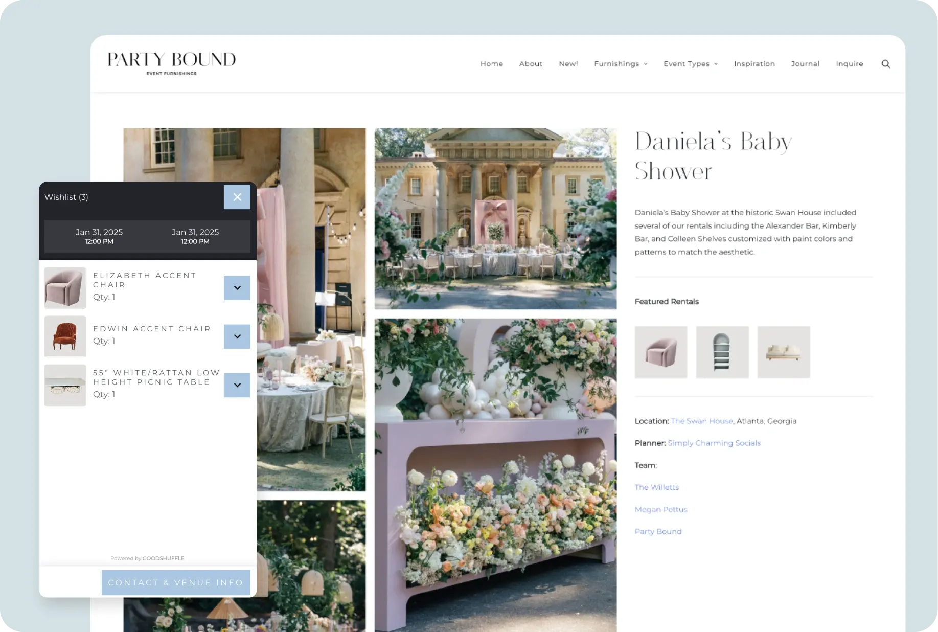
Party Bound has a classy, timeless website that mirrors its refined brand identity. Elegant typography and understated design elements divide each page into thoughtfully curated sections — not to mention the beautiful table setting that dominates the homepage. The inspiration page is also a great way of showing clients how Party Bound’s inventory offerings come together, making it easy to upsell.
Kate Ryan Event Rentals
Location: Tampa, FL
Website Link: kateryanevents.com
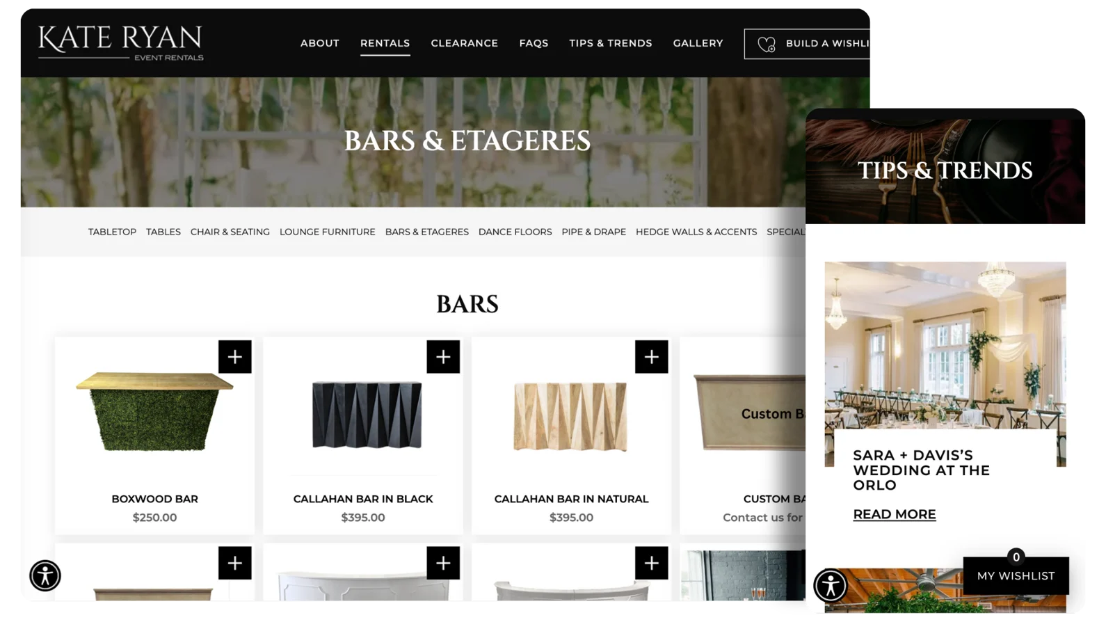
Kate Ryan Event Rentals uses a well-rounded mix of photos, design, and text to guide people through its website. Its Tips & Trends section features case studies of recent events, including not just photos but commentary that makes the brand feel warm, personable, and knowledgeable about local venues and vendors. Its online rentals are well-organized, easy to use, and mix things up with fun line illustrations on category pages.
Ribbon & Blue Party Rentals
Location: Charlotte, NC, Raleigh, NC, & surrounding areas
Website Link: ribbonandblueprobartyrentals.com
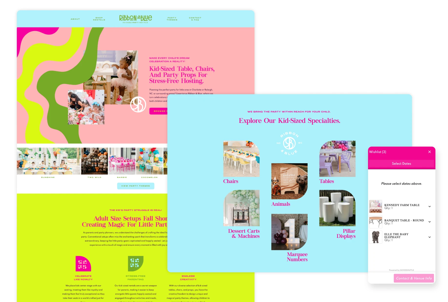
Ribbon & Blue Party Rentals brings childhood wonder to life on their vibrant, playful website. This company specializes in kid-sized party equipment, and their homepage immediately showcases their niche with bright photos of children enjoying miniature tables, chairs, and themed setups. The site’s organization makes it simple for parents to browse by color scheme or party theme (including trendy options like Barbie and dinosaur parties). Ribbon & Blue also shows off how easy it is for clients to book in 3 steps by submitting a wishlist — and it’s all powered by Goodshuffle Pro’s Website Integration.
Inspired by these amazing event rental websites?
These exceptional event rental websites show what happens when you combine great design with innovative features like Goodshuffle Pro’s Website Integration. From showcasing credibility with big-name clients to streamlining the rental process with intuitive interfaces, each website demonstrates how a well-crafted online presence can drive revenue and set your businesses apart in the competitive event industry.
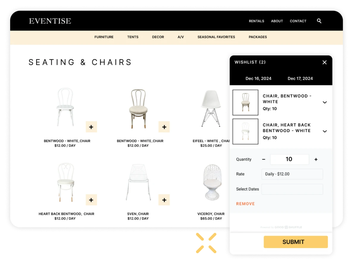
Feel free to take inspiration from these examples to transform your WordPress, Squarespace, or Webflow website into a powerful tool for success. After all, your business is unique — shouldn’t your website be unique too?
FAQs
Website costs vary significantly based on complexity and whether you use a DIY builder ($20-50/month) or hire a developer ($3,000-15,000+). The key is ensuring your site can integrate with your rental management software and showcase your inventory effectively.
High-quality imagery of your inventory in use at real events. Clients need to visualize their dream event using your items, so professional photos and videos are worth the investment.
Most successful rental companies use transparent pricing, even something as simple as “starting at $400” if your rentals are highly customized. Focus on making it easy for clients to get a ballpark price and request quotes online. For more on website pricing, check out our newsletter on the topic here.
Showcase your unique brand personality, feature client success stories, and highlight what makes your service special (exclusive inventory, exceptional service, local expertise, etc.).
Online inventory browsing, quote request forms, photo galleries of past events, clear contact information, and ideally the ability to create wishlists or packages for their event.
